Updates
We’re constantly improving Framer. See the latest features and improvements.
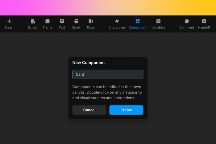
Introducing Smart Components—interactive components that have their own interactions, animations, and properties. And require no code to build.
To create a Smart Component use the shortcut command + K or go to the Component section of the top toolbar. Once your component is created you’ll arrive in the Component Canvas and you can start building. The key ingredients in creating Smart Components are Variants and Variables.
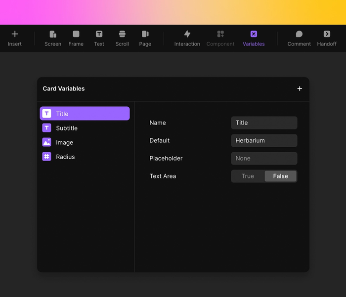
Variants are different visual states of a component, such as disabled, error, or hover. You can add as many Variants as you need to your components in the Component Canvas. You can easily add hover and pressed states to your components with infinite visual Variants then, add Variables to customize even further. Variables are custom properties you can expose in your components. Anything can be a Variable from text to color to border radius making it easy to customize any property you need in any component instance.
To unlock even more advanced layouts, you can even nest Smart Components, each with their own Variants and Variables, then compose them to create the most realistic interactive experiences.
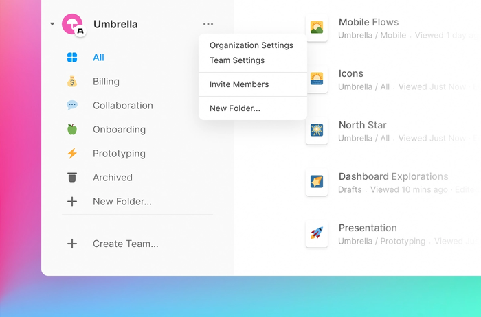
Templates provide a starting point for new projects. You can choose from 13 default templates in the new project modal or create your own and share them with the rest of your team. In order to create your own, you can go to the templates folder within your team and start from scratch or convert any of your team projects into templates.
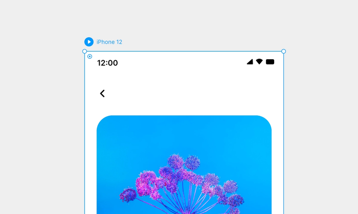
You can now find a better preview experience in Framer. Previewing has been redesigned for quick iterations, previewing in context, and showcasing your work. When a layer is selected on the canvas, you will see a preview icon attached to the layer. This means your mouse travels less distance to the preview icon and a shorter time in between previewing and iterating.
This release includes new options for customizing how your prototype is displayed in the preview window. Starting with a full collection of realistic and clay devices that features phones, laptops, monitors, watches, and TVs. The new options also include device hands and custom backgrounds that open up infinite customization possibilities. These custom display settings will also remain when you share a link to your prototype, so you can showcase the most polished version of your prototype with anyone. In addition, when you’re previewing you can quickly switch between layers and recently viewed elements in the Recents dropdown in the upper left corner.
Introducing the Assets section of the Insert Menu for easy access to useful design resources. In this new Insert Menu category, find shapes, icons, and illustrations from all the best creators and libraries. Designing in Framer has never been easier. With quick access to hundreds of icons available from in the canvas, and customizable illustration libraries you’ll have a beautifully designed prototype in no time.
Check out this category to see all new pre-made vector shapes and custom icon sets, including Feather icons, Material icons, Hero icons, and Phosphor icons. Plus the Humaaans illustration set.
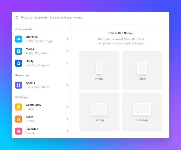
The Screen tool provides a solid starting point for every new project. You can choose from a range of device presets including, everything from desktop to watch interfaces. Once your screen size is selected, use the Frame tool to continue designing interface elements.
With the introduction of the Screen tool, your shortcuts have also been shifted. Press the ‘S’ key to create a new screen and press Shift + S to create a new stack.
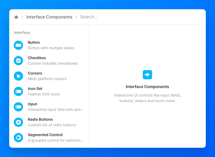
An updated Insert Menu featuring new categories created with the goal of putting exactly what you need at your fingertips. There are now 6 categories to help you quickly find any component you can think of.
Interface is where you can find tons of UI elements, including buttons, inputs, icons, checkboxes, and more. All interactive out of the box.
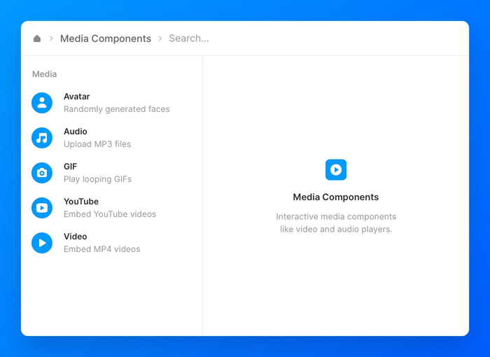
The Media section contains any components that provide or embed media from an external source. Here you can find things like video and audio players.
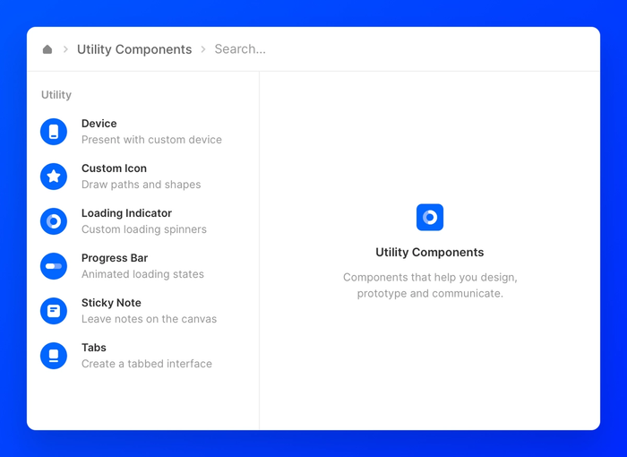
Utility components give functionality to your designs, prototypes, and canvas. Here find loading indicators, progress bars, sticky notes, and more to ensure you have everything you need to communicate your ideas.
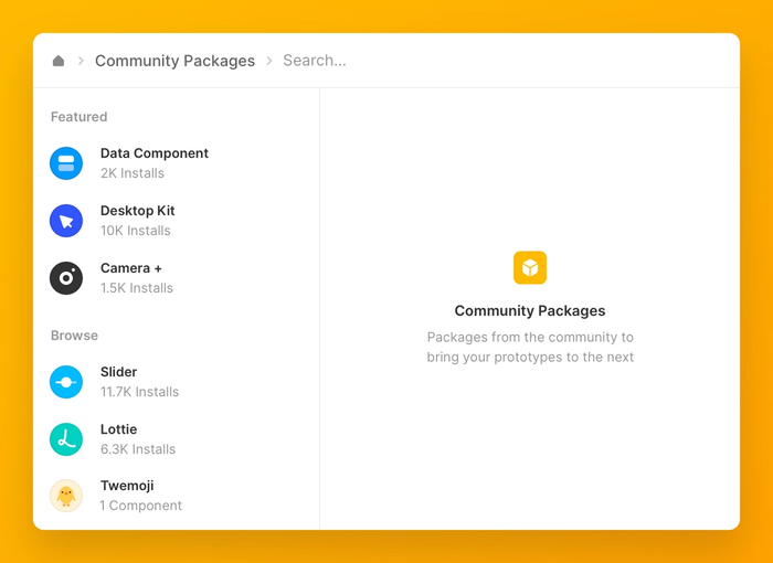
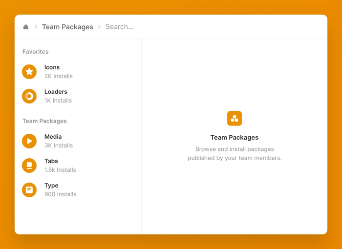
In the Community packages section, browse an open-source library of thousands of free components to jumpstart your prototypes. Here you can find anything from simple buttons to advanced data population components. Check out the Featured section to see the most popular Community packages.
Team packages are by your team and for your team, totally private and designed to help your team share and use your most up-to-date assets. And finally, any package you save from your team or the community can be found in the Favorites section.
New categories are just the beginning, the real magic is what you will find inside. In addition to the new structure, we’ve added more interactive components built for you by the Framer team. Find an Avatar generator, Cursors for MacOS, Rating indicator, Progress bars, a Select component, and Date & Time displays.
Use these components and more to add easy interactivity to your prototypes. Just drag from the Insert Menu, drop anywhere on the canvas, and bring your prototypes to the next level.
A cleaner, more focused interface with more real estate allows you to focus on the properties you use most with less distraction by those you don’t need as often.
The indentation on properties helps improve scanability and predictability, helping you find properties faster. And moving properties like Radius and Opacity away from Layout and under Style, creates a much more sensible division of properties.
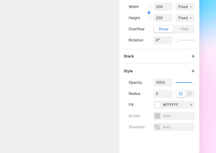
The experience of adding, deleting and editing properties that can have multiple rows/values (like Interactions and Shadows) is consistent and easier to understand for users who are new to Framer. To add a new property to your selected element, simply click the + icon next to the Style section. Choose your property and it will be added to your properties panel so you only have to see the properties that you are currently using.

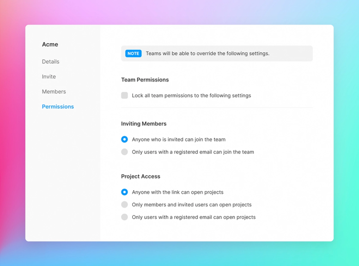
A new feature for Enterprise teams! The organization entity provides support for multiple teams within your company in Framer. This new level of hierarchy is perfect for multiple subsidiaries within a company, different product teams, multiple teams within a product team, and even agencies working with various clients.
With this feature team admins can manage the entirety of their Framer user base in one single location.
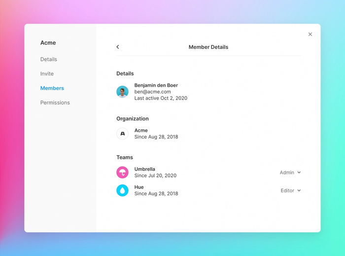
Enterprise team admins can now manage permissions for all the teams in an organization and get an overview of every Framer user at their company. Team admins can control project access, prototype sharing, and team member invitations for whole organizations by locking the settings for every team to the organization.
Make the most out of your custom fonts by sharing them with your whole team. Team fonts allow anyone on your team to have access to the correct fonts to fit your company’s design and branding.
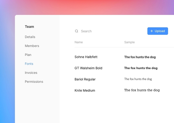
Team fonts appear in Team settings
Pages have arrived in Framer. You can add multiple pages to help organize your projects and break-up larger prototypes. To create a new page in your project, open the page section in the layers panel and click the ‘plus’ icon. Here, you can drag and drop to reorder your pages as well as rename them.
Creating a page
To share your work, you can link to a specific page or even a specific frame to make sure your team members are viewing the correct parts of your project. Select the page or frame you want to link to, copy the URL, and the link will display the correct element in the canvas when opened.
Sharing a link to a specific page


